Hidden In Plain Sight—A History of iOS Foreshadowing iPhone
Nov 30, 2020 • Extra Ordinary
For the first four years of the iPhone’s life, the hardware and software were announced together in the summer. Starting with iOS 5’s announcement in July and the iPhone 4s announcement in October of 2011, we got a sneak peek of the software before the hardware was announced.
This cycle of software in the summer and hardware in the fall has led to an interesting pattern—some traces of the evolving hardware are left out in the open for all to see in the software. Questionable software design decisions suddenly make sense in the context of the new phone. Let’s take a look at some of these examples.1
iOS 6 Auto Layout preparing for new sizes
With the ever-growing roster of iOS and iPadOS devices nowadays, it’s hard to believe that the iPhone went from its announcement in early 2007 all the way up to the announcement of the iPhone 5 in late 2012 with the same 3.5″ display size. The iPhone 4 doubled the number of pixels, but without any scaling—it was the same rectangle with a sharper image.
The alarm bell rang when iOS 6 brought Auto Layout on iOS3. When arranging buttons and UI elements for an app, one can specify where exactly on the screen it should go—an easy and safe way to build an app if you know it’ll be running on 3.5″ displays. Auto Layout let developers arrange buttons and UI elements with constraints—this far away from the edge of the screen, this far away from that button, halfway centered between the bottom of this titlebar and the top of the toolbar, always at least 50 points away from this box, etc. The idea is that you write this code once and your app magically scales to different sizes without arranging the buttons for every situation.
In the fall, to absolutely no one’s surprise, the iPhone broke free of its 3.5″ prison to the magical world of 4.0″. The display got taller for the first time. To make it easier on developers, it kept the same display width, but added height. Luckily, absolutely everyone had adopted Auto Layout over the summer and no one complained.
iOS 7 and the iPhone 5s
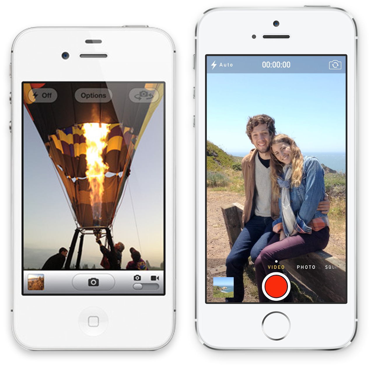
The new camera UI made room for new camera features
The iOS 6 camera app was remarkably simple. In terms of capture modes, there are two: picture and video. This allowed the UI to get away with offering a simple toggle switch.
The upcoming iPhone 5s, to be introduced in the fall, would add slow motion video for the first time. A scrolling modal wheel reminiscent of a Nikon camera took the place of the simple switch. Panorama, hidden inside a menu in iOS 6, was now easier to access as another mode on the wheel alongside Photo and Video.
Swipe to unlock?
Arguably one of the most iconic UI elements of early iOS was “swipe to unlock” on the Lock Screen. iOS 7 distilled this element from a big grey arrow to a simple line of glowing text. With the Touch ID sensor on the iPhone 5s, you no longer had to swipe-to-unlock at all, allowing one to unlock with a press of the Home button.
iOS 9 app switcher designed around 3D Touch
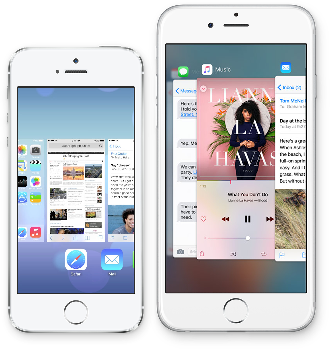
The app switcher in iOS 7 and 8 featured previews of the app with their icons below. It was highly functional—you could flick your thumb across the small icons to quickly scroll left-to-right, or drag across the app previews to scroll one-at-a-time.
Curiously, the multitasking view introduced in iOS 9 scrolls the opposite direction, right-to-left. The bigger app snapshots fill more of the screen with the most recent app sliding in from the left edge. The redesign provides the visual metaphor that all your apps are hiding behind the current one like a stack of cards, and you’re flicking over to the next one.
This all made sense in the fall of 2015 when Apple unveiled the iPhone 6s with 3D Touch. It was adopted universally by some proactive indie developers, but, sadly, never got much attention from many of the top-charting apps. Apple implemented it system-wide to set a good example. When force touching the left edge of the device, you could swipe your thumb over to switch to the next app in the stack. The new look for the app switcher, where apps slide in from the left, was designed around this feature.
iOS 11 accommodating the all-screen iPhone X
Control Center
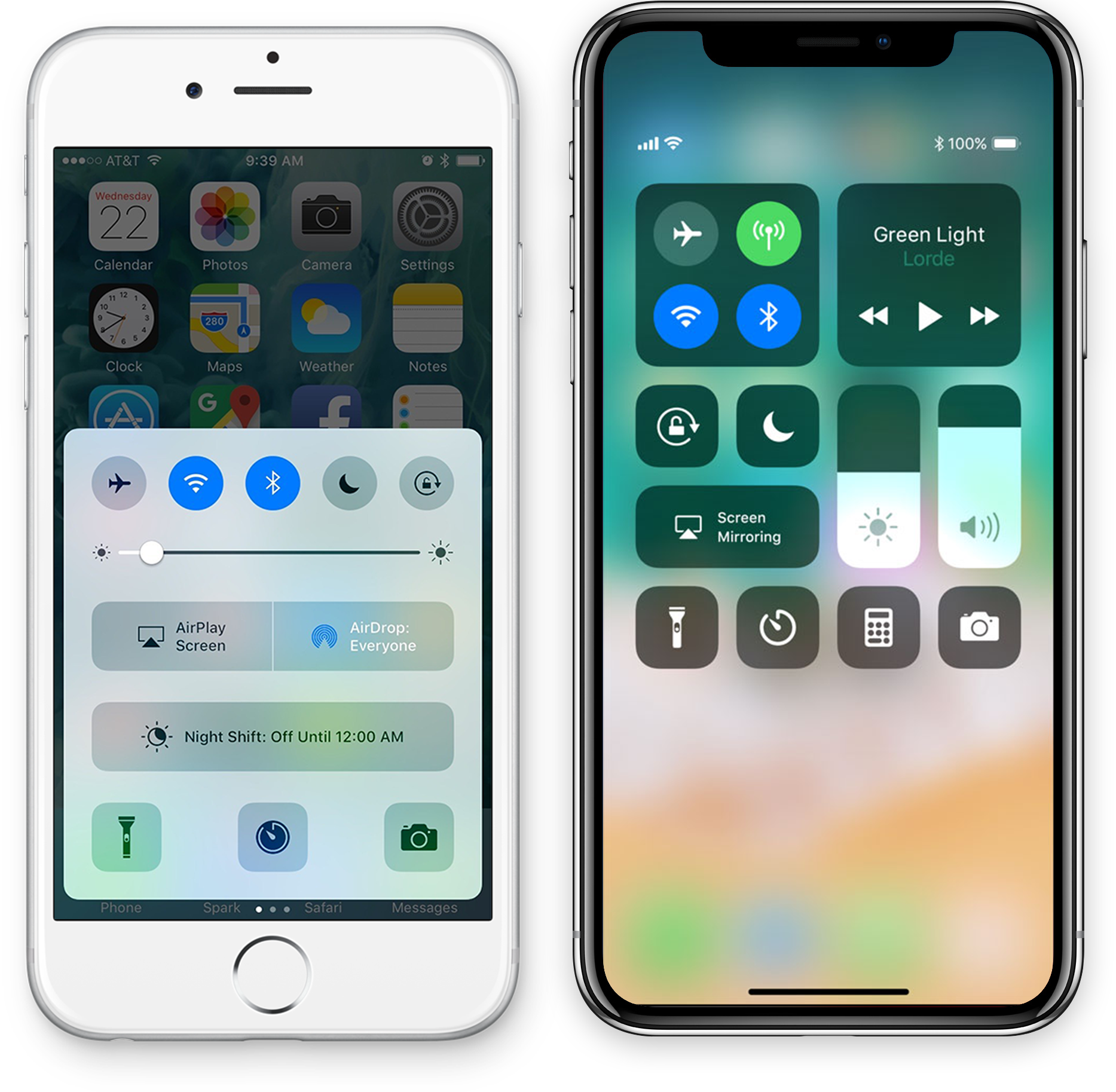
Control Center may have gone through a few different looks since its introduction in iOS 7, but the central idea of a glass panel you swipe up from the bottom of the screen to invoke was a constant. That was not compatible with the upcoming iPhone X, which would use the swipe-up gesture to dismiss the current app. Since Control Center would be invoked from the bottom edge on Home Button-iPhones and from the top right corner on the iPhone X, Apple needed a design that would make sense for both gestures.
Control Center was freed from its panel to occupy the entire screen. If it is invoked with a swipe-up gesture, as it is on iPhones without a Home Button, the controls are bottom-justified. On the iPhone X, where you pull down from the top-right, the controls are top-justified. The free-floating design accommodates both gestures—and gives it room to grow should users choose to add more buttons.
Labels removed from the dock
When Apple gave the iPhone X display rounded corners, they simply could not resist giving the Dock rounded corners that nestle inside them, with the icons arranged perfectly inside it. This concentric symmetry just wouldn’t have the same effect if the app labels appeared below them.
Smaller cellular signal icon
The cellular signal icon in iOS 7–9 (borrowed from an early iPhone prototype) uses five circles instead of the more familiar bars. While debatably more aesthetically pleasing, the icon is simply too wide to fit into the small icon area of the iPhone X.
Cover Sheet
The iPhone X simplified the process of unlocking the phone. No longer is authenticating the phone a step one has to consciously take—you don’t have to type in a passcode, you don’t have to press your finger on a TouchID sensor—just look at it and it’s unlocked.
In order to polish this design as much as possible, Apple sanded down the arbitrary difference between the Lock Screen and Notification Center. After all, both places show your notifications and widgets.
iOS 13 context menus replacing 3D Touch features
3D Touch, as continued from above, did not take the world by a storm as Apple may have hoped. Never mind that it’s a gesture with no visible indicator of where it works—it wasn’t adopted universally enough for users to expect it to work. Compare this to apps that don’t implement swipe-to-go-back, which stick out like a sore thumb.
Apple, unwilling to give up the functionality it afforded them, ironed 3D Touch together with the long-press gesture as a means of creating the context menu. That way, when the iPhones 11 and 11 Pro shipped without the pressure sensors necessary for 3D Touch to work4, the context menu was spun as a more versatile UI element for developers to use, in addition to bringing feature parity to iPads (now christened with iPadOS).
Footnotes
- In researching this story, I reached out to my fellow2 esteemed and honorable Apple tech writers: John Gruber, Casey Liss, Stephen Hackett, Joanna Stern, John Voorhees, Federico Viticci, Dan Moren, Jason Snell and John Siracusa. ↩
- I am not an esteemed nor honorable Apple tech writer. ↩
- Thanks to Casey Liss for the tip on Auto-Layout in iOS 6. ↩
- The iPhone XR shipped without 3D Touch a year earlier alongside iOS 12 but was not their flagship iPhone at the time, which is why I consider it a feature removal of 2019, not 2018. It evolved into the iPhones 11, which were. ↩
Reply by
Email