What’s in a Mac app?
That which we call an app by any other operating system…
Oct 7, 2022 • Extra OrdinaryWhy do Mac users care so much about consistency? Jack Wellborn, for Worms and Viruses:
Surface area.
iOS and Android apps always run in full screen. iPadOS apps mostly run in full screen. Even many Windows apps typically run in full screen. Most Mac apps, on the other hand, are typically windowed and expected to share the desktop with other windowed apps.
When surface area is high, the role of the operating system shifts […] to providing a cohesive user experience for all apps.
‘Surface area’ is a great turn of phrase that instantly clarifies Wellborn’s theory. I can believe this as a contributing factor, but I don’t think it’s the full story.
You rarely hear Windows users complain about programs not being “Windows-like”, and there isn’t really any fervent calls for “iOS-like” or “Android-like” apps either, but “Mac-like” (or Mac-assed, if you prefer) is something that exists.
Proof by counter-example: iOS-like apps are definitely a thing.
iOS has a strong convention towards bottom tab bar navigation; each tab can have its own view stack that you can swipe backwards to navigate. Android has long pushed towards “hamburger menu” navigation and the system back button. Apps that reverse that feel very much out of place and ordinary people do notice.
Take Apollo versus Reddit, Aviary versus Twitter, Overcast versus Spotify. Three indie apps that are broadly praised for their respect of the iOS platform versus three apps that are widely panned for breaking its conventions.
Let’s go deeper
There’s an underlying question worth exploring. Why do I feel compelled to maximize everything in Windows, yet cram as many things as I can fit at once on my Mac? I think it comes down to three forces inflicted by the design of each operating system:
-
Windows has a prominent Maximize button on every window. The Mac, throughout most of its life, used the same button to fit the window to the exact size of its content.
-
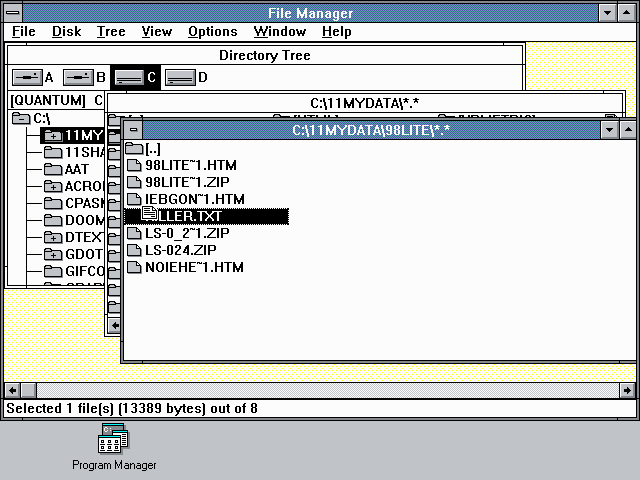
Most Windows programs assign a single window to a single program. This technical limitation had already come back to bite them by Windows 3, where they introduced the window-within-a-window. This lived on for over 20 years in Microsoft Office. The Mac has always separated windows from apps; this pushed people towards the pattern of opening many files across many different windows.
-
The Windows taskbar was introduced as an omnipresent interface that organized every open window, allowing people to switch between full-screen experiences with a single click. The most comparable interface element of the Mac, the Dock (and the MultiFinder menu that preceded it), is organized by app. Mac OS didn’t have a user interface for picking a specific window amongst every open window until Mission Control in 2011. But if you can see both windows at once, they’re only a single click away.
All of these forces push people towards maximizing everything in Windows and cramming apps side-by-side in macOS.
While some of these forces are no longer present — the green button on the Mac now toggles fullscreen — momentum is slow. The design paradigm of an operating system has knock-on effects on its developers for years.